How Different Beauty Categories Require Completely Different Packaging Design Approaches
One of the most common mistakes brands make when approaching packaging is treating “beauty packaging” as a single category with a single set of rules. In reality, the packaging design logic for a face serum, a lipstick, a perfume, and a shampoo have almost nothing in common — different materials, different structural requirements, different visual conventions, and different user expectations.
Understanding these differences is the starting point for packaging that actually works for the product it holds.
Skincare: Functionality Leads, Aesthetics Follow
Skincare packaging design is governed more by functional requirements than almost any other beauty category. The formulas are often sensitive — active ingredients that degrade with light exposure, water-based formulas that need airtight dispensing to prevent contamination, oils that require materials that won’t react over time.
These constraints shape the structural choices before the visual ones. Vitamin C serums typically need opaque or amber glass to protect against UV degradation. Retinol products often use airless pump systems to minimize oxidation. Rich creams go into wide-mouth jars for ease of access; lightweight serums go into droppers or pumps for precise dosing.
The visual language of skincare packaging also tends toward restraint — clean lines, minimal color, clinical or natural materials. This communicates efficacy and trust. Busy graphics or bright colors tend to read as mass-market in the skincare space, even if the formula is premium. The packaging is quietly telling the customer that what’s inside is serious.
Color Cosmetics: Impact and Portability
Makeup packaging operates on completely different principles. Where skincare tends toward restraint, color cosmetics often embrace boldness — because the products themselves are expressive and the packaging needs to reflect that.
But makeup packaging also has practical demands that skincare doesn’t. Products are used on the go, in handbags, in front of mirrors in poor lighting. Lipstick tubes need to be easy to open with one hand. Compact mirrors need to close securely. Mascara wands need to wipe cleanly. The physical interaction with the packaging is frequent and often hurried, which means usability is a design requirement, not an afterthought.
The visual design in this category has more latitude. Color, pattern, texture — all of these are used to express brand personality in ways that would feel out of place in skincare. Limited edition packaging, collaborations, and seasonal finishes are common because the customer’s relationship with makeup is more playful and trend-driven than their relationship with skincare.
Fragrance: The Bottle Is the Product
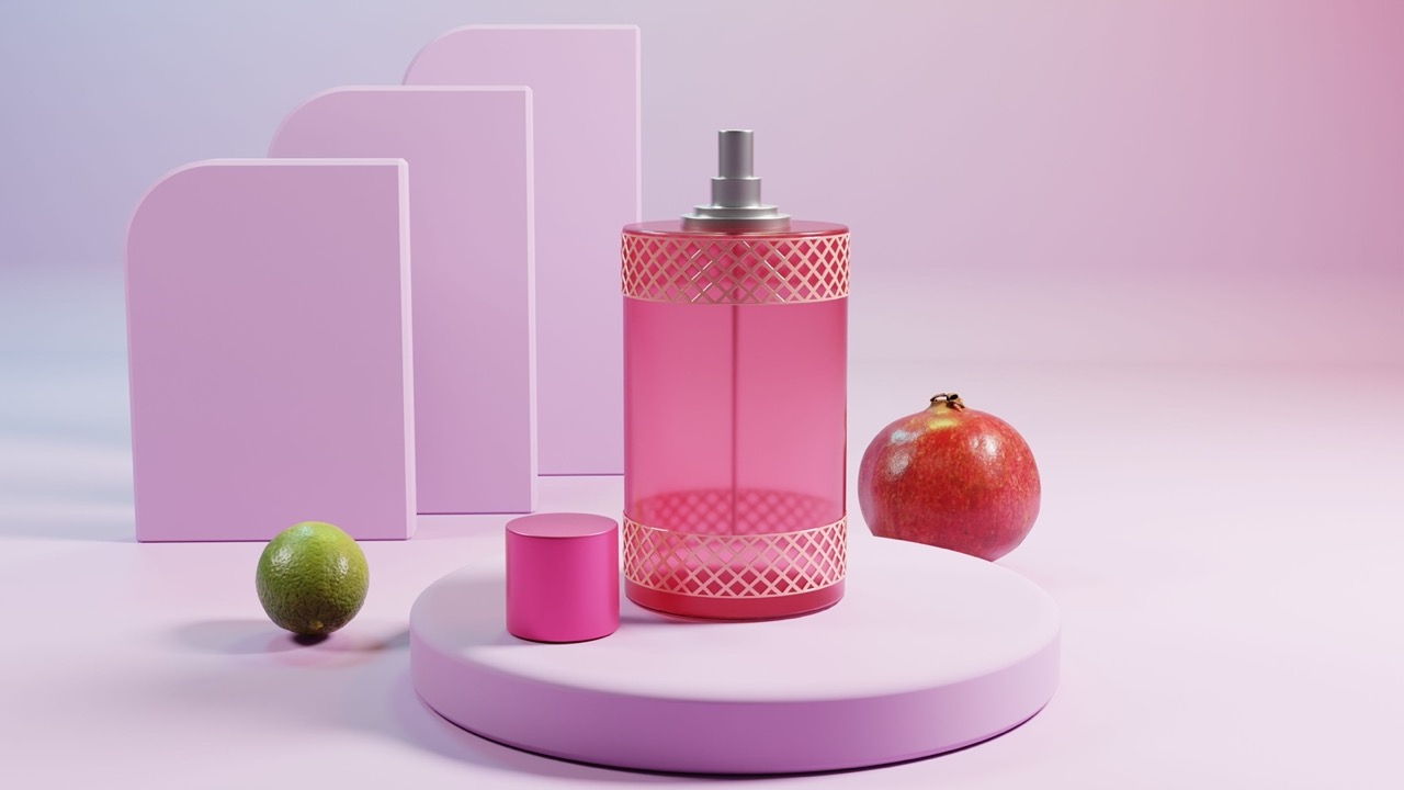
Fragrance packaging is unlike any other beauty category because the bottle is often as important as the juice inside it. Perfume bottles sit on dressing tables and bathroom shelves permanently. They’re objects that people live with and display, not just use. The visual and tactile quality of the bottle communicates something about the fragrance before the cap is even removed.
This is why fragrance packaging tends to be the most sculptural and design-intensive in the beauty industry. Heavy glass, unusual shapes, custom caps, intricate surface treatments — the investment in the bottle is higher per unit than in almost any other category.
The structural requirements are also specific. Fragrance bottles need to work with atomizer mechanisms that dispense a fine mist without clogging. The glass needs to be thick enough to feel substantial without being so heavy that it’s impractical. The closure needs to create an airtight seal without requiring force to open.
Hair and Body: Scale and Durability
Haircare and body care packaging operates at a different scale from face products and presents its own set of challenges. Bottles are larger, which means the structural integrity requirements are higher — a 250ml shampoo bottle that’s picked up every day in a wet shower needs to withstand a lot more than a 30ml serum.
The visual design language in this category tends toward two poles: either clearly functional (bold typography, easy-to-read product names, practical dispensing) or deliberately premium and lifestyle-oriented (minimalist design that looks at home in a styled bathroom). The mass market skews toward the first; salon and independent brands increasingly aim for the second.
Sustainability considerations also tend to be more prominent in this category, partly because the volumes are higher and partly because the customer base has shown strong interest in refillable and recyclable formats.
Why Category Expertise Matters
Because the packaging requirements vary so significantly across categories, the expertise required to design well for each one is different. A team that knows how to develop a beautiful skincare line may not have the structural engineering knowledge to develop functional makeup packaging. A fragrance specialist may not understand the dispensing requirements of a hair oil.
This is one of the reasons that packaging design for beauty brands benefits from working with partners who have depth across categories — not just design capability, but manufacturing knowledge specific to each product type. The decisions that look purely aesthetic often have structural or production implications that only become visible when you know what to look for.
The Common Thread
Despite the differences between categories, the underlying principle is consistent: good beauty packaging starts with understanding the product and the customer, and builds outward from there.
The structure serves the formula. The materials suit the use context. The visual design speaks the right language for the category and the brand. When all of these things are aligned, the packaging feels inevitable — like it couldn’t have been anything else.
That quality doesn’t happen by accident. It happens when the category-specific requirements are understood from the start and built into every decision along the way.